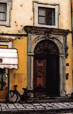
Open the Door
First, I copied the original image, but cropped, to a new file, with low opacity. I also turned it to Grayscale so I could use the Duotone feature. For this first layer, I chose two hues of red.
Second, I created another layer, copied the image again in low opacity, but left it coloured. This is such a great trick, it really feels like you're laying a vellum on top of an image. I then repeated the process with a third layer, just like the first one, but with purple Duotone, to give more depth to the colours which were now rich and juicy.
Third, I used the Dry Brush in the Artistic Filters over and over, calibrating it slightly differently and using the Fade function in Edit every single time. I can't be more specific, because I couldn't keep track, I just fiddled with it until I liked the end result. I think I did the Dry Brush thing about 3 or 4 times.
Finally, I used the Smudge tool to erase the lettering on the store awning and the plaque on the door, and filled the pipe that was still showing on the right with the same colour as the wall.

Gravure
Just like Frances, I also felt that this image just called for some "antiquing" (love your title, Frances!). For this one, I used the Find Edges option in the Stylize tool in Filters, but edited it with the Fade option, and chose to go with Multiply instead of Normal with about 50 percent opacity. I repeated this step about 2 more times, and felt happy with the final, sketchy, inky look.
I've learned about GIMP a little bit this week - it's a free download and a lot of people swear by it. I think I'll save my next attempt for that new tool, as soon as I figure out how to download it.
Finally, as soon as my *%@!*&?!!@! laptop cooperates, you'll be able to see the new "wall" up at Maraya Galleries, as well as the completed Lily Wall (done but refusing to upload). Sometime before the end of this decade. Along with the new logo (not done yet) and the new features (still cooking). And more. Keeping my fingers and toes crossed. I'll just go rest my head now.


4 comments:
I like that Rima - and interested that you had the same idea of making the outside door look like an inside door. Trompe l'oeil by colour.
before I coloured mine, the whole thing looked as if the street was inside and the sky was outside the windows. that is gibberish - hope you know what i mean.
I like the opacity feature and used it with layering and cropping for my first attempt, but I was short of time eventually and had forgotten how to shift the layers as I did for the lily.
These challenges are amazing. Already yours and Frances' are inspiring examples to us how different the same subject can look.
I promised my mom I would do a mini-tutorial using adobe on something she's trying to do. Should be a nice warm-up for me for this challenge.
I LOVE the gravure, Rima. Still haven't started...Your post made me laugh so hard I almost had a stomach ache!
I love the rounded, solid way the first image looks. Almost as if the paint has been blocked in. These challenges are so much fun and so educational for me, I learn from all the postings and can't wait to try it on my own.
Post a Comment